Retro//Vrs
Created an MVP for Retro//Vrs iOS mobile app to help users have a smoother, trustworthy and more engaging buying and selling process.
TIME: 10 DAYS, DEC 2022 | TEAM: LOURDES C. & MAHNOUSH N. | ROLE: USER RESEARCH, WIREFRAMING, VISUAL DESIGN, PROTOTYPING, ANIMATIONS | TOOLS: FIGMA.
The Challenge
What is Retro//Vrs and how can we help?
Retro//Vrs is a phygital marketplace for pre-owned luxury goods, with an embedded blockchain secured authentication service that protects customers and sellers against counterfeits.
They are currently in their MVP phase and are working on an iOS mobile app. Their product revolves around 3D assets, from capturing, editing, displaying to managing them.
The challenge was to create a smooth user experience and participate in the creation of their MVP product
Solution
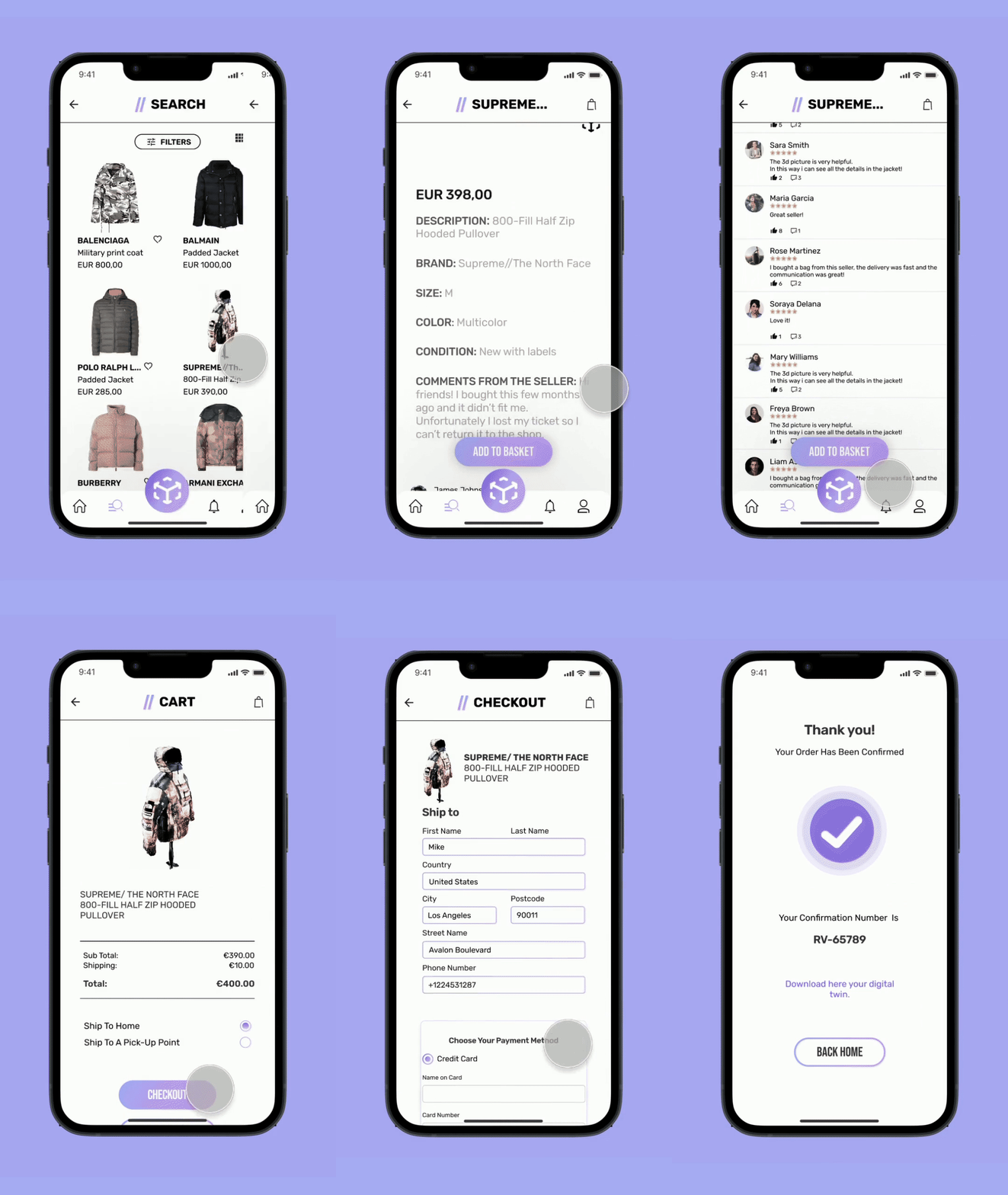
View products in a fun way!
Guided scanning process instead of existing video tutorial.
Take away menu bar to keep focus on completing sale.
Research
A little more background…
Listening to our Stakeholders…
They had some ambitious plans for the future but these were their main goals for the moment.
There is nothing else like this…
We decided for a SWOT analysis due to the lack of relevant competition Retro//Vrs had. One of the main areas to focus was lack of understanding by the users as they can’t trust something they don’t understand. We decided to implement simple language so we wouldn’t confuse and lose the client and wouldn’t interfere with some of the main values of the company: transparency and trust.
The current app was not fully developed yet, however by doing the heuristics analysis we were able to help the user gain control and prevent errors in our design.
Uncovering our audience needs…
We did 8 qualitative interviews from fashion influencers to second-hand vintage luxury shop owners.
As far as buying and selling these were the most important key points:
How might we help the buyer…
find what they are looking for more efficiently?
make sure that the product is original?
see the real condition of the product?
How might we help the seller…
Have a smoother and successful scanning process?
Have more control during this process?
Problem statement.
Pre-owned luxury product buyers and sellers need to find a more reliable and less time consuming way to trade their products because current platforms don’t provide transparent and efficient processes regarding authentication, picture reliability and communication. This leads to frustration within the users and makes them more hesitant to consume the sale
Brainstorming
Ideation and must-have features
MVP Statement
The goal of our app at the bare minimum is to help buyers and sellers of pre owned luxury goods have a more efficient and reliable trading process.
Sellers will be able to create and preview their own 3D model before submitting it for authentication. This will be done by following a guided and interactive scanning process. Buyers will be provided with a digital twin as an authenticate certificate after purchasing, avoiding being counterfeited.
By providing these features, users will have full control and freedom to display reliable content as well as experiencing a less time-consuming and trustworthy trading process.
Testing
Failing fast and cheap
This was the main feedback after our concept and usability testing.
Change shape of main icon, it was generating confusion.
Keep comments in same page.
Showcase authentication instead of “Gifts under 500”.
Small details count, change word “opinion” to “reviews”.
Keep iOS navigation bar, easier for users and developers.
Take out menu bar to help user finalize sale.
We created a user flow for the buyer and one for the seller.
Learning and getting inspired by others…
Visual Competitive Analysis
We compared Goat, Stock X and an indirect competitor relevant due to the use of AR, Dropp TV.
We observed Goat uses a lot of whitespace which helps reduce the feeling of overwhelm. Most of them use dark and plain colors which are neither fun or exciting.
This were points to consider as they contrast the main attributes our stakeholder’s wanted their brand to reflect which were: authenticity, fun, excitement, innovation and transparency.
Standing out from the crowd.
Style Tyle
We knew our stakeholders loved their logo and its purpulish color. Based on research we found this tone to be pantone’s color of this year.
It is original and unexpected and is meant to symbolize the transition into a new post-pandemic era and the importance of virtual reality. This color is playful, imaginative, and spirited - words that represent both our stakeholders and their brand.
Time was ticking
We realized we were failing to accomplish being authentic, we were too similar to other apps. We thought about doing animations to make the experience more fun and exciting as our stakeholders wanted, but we were limited on time. We had to prioritize.
Solution
View products in a fun way!
Guided scanning process instead of existing video tutorial.
Take away menu bar to keep focus on completing sale.
Always be iterating…
Create a rolling bottom menu bar.
Guided animated for scanning process.
Always be learning…
Prioritize, progress is better than perfect.
We are so excited to announce we were chosen to present our project at the Ironhack show in the end of January so we will be able to incorporate this iterations, stay tuned!
We’ve got news!
Let’s build something amazing!
marimaruxui@gmail.com
+32471593816


